Some decisions have more dimensions than any one view can show — every sort order surfaces one thing and hides the rest. You ask Claude in chat, and the chart appears as part of its answer with all the tradeoffs visible at once. You work through it together, filtering and testing scenarios until a shortlist takes shape.
Here a researcher has a long list and needs to decide which few to write. Claude plots them on a risk-reward scatter with filters that narrow chart and table together, and buttons that turn the picture into a ranked shortlist.
I'm planning grant submissions for next year and there are a lot of funders to choose between. Can you show me the tradeoffs in a way I can actually see — like, which ones are long shots for big money versus safer bets for smaller awards? Flag anything with a deadline coming up soon.
If you have a spreadsheet with amounts, rough success rates, and deadlines, attach it. If not, describe the landscape and Claude can populate from what it knows about the major programs.
Nothing strictly required. For a chart grounded in your actual pipeline, attach the sheet.
If the pipeline lives in a Google Sheet, connecting Google Drive lets Claude read it directly. A Project means you can come back mid-season, add a new RFP, and ask for a re-plot without re-uploading.
Claude folds four spreadsheet columns into position, size, and color on one chart — so all the tradeoffs are in view at once. Long shots cluster upper-left, safe bets lower-right, and the distance between those corners is where your strategy sits. The expected-value card at the top is the one number that accounts for realism, and the gap between that and the raw total tells you how much of your list is lottery tickets.

Click any point on the chart and Claude expands it below — the chart stays, the profile opens beneath.
The NSF CAREER dot — open it up. Deadline, page limits, what makes an application competitive.
Claude writes a week-by-week schedule using the deadlines from the chart, with start dates calculated backward from each submission date.
Turn the next-90-days grants into a submission timeline. Work backwards from each deadline and tell me when to start each one.
Claude redraws the chart with your update — the submitted grant moves to in-progress, the remaining dots re-rank.
I submitted the R03 yesterday. Redraw with that one marked as in-progress and re-rank what's left.
"Long shots for big money versus safer bets" names the tension directly — that's what gets a chart where the tradeoff is spatial, with every dimension visible at once. Works on any decision where you're holding several variables: staffing, roadmap priority, anything that doesn't sort cleanly by one column.
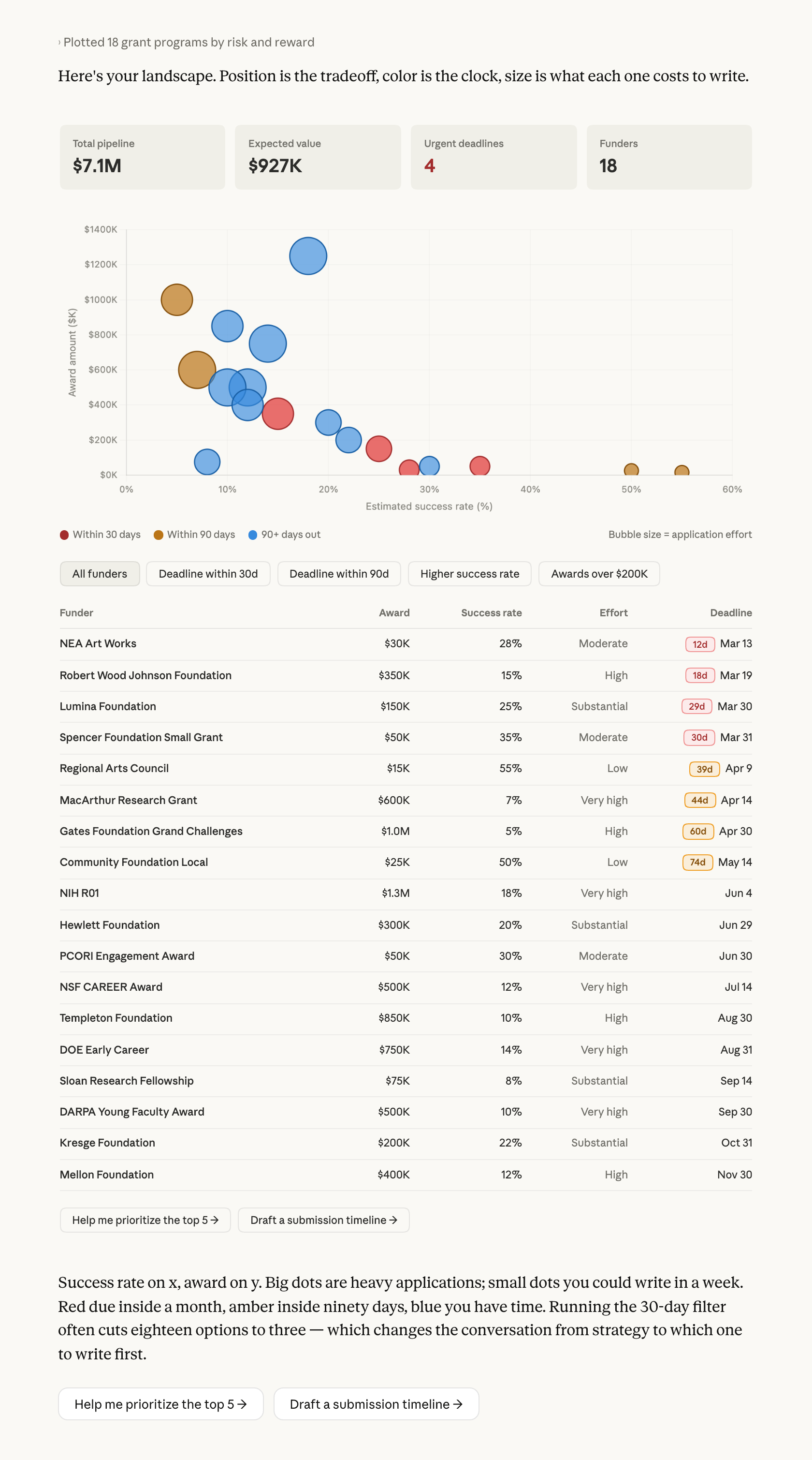
Ran this without a sheet, so Claude filled in the numbers? The success rates are roughly right for major federal mechanisms, less certain for foundations that don't publish. The chart shows the shape of the decision; the program page confirms any single dot before you write the application.
Save as Artifact lets you come back mid-season — submit one, tell Claude, redraw with the new landscape. Or ask Claude to turn the deadlines into a schedule you keep. The chart is a working surface you return to as the season goes.
