Education
Custom visuals
Custom visuals

Chart your data in conversation with Claude before you commit to a reading

Upload a CSV and Claude builds the correlation grid inline, flagging the patterns worth a second look. The flags are a starting point — you click into what's interesting and the conversation goes from there.
Try in Claude
  • Author
    Anthropic
  • Category
    Education
  • Model
    Sonnet 4.6
  • Features
    Custom visuals
  • Share
    Copy link
    https://claude.com/resources/use-case/chart-your-data-before-you-commit
1

Describe the task

You have data and want to see what's in it before you start working. Ask Claude, and the chart comes back with a read on what stands out — from there you work through it together.

Here a researcher has survey data on study habits and GPA before a committee meeting. Claude builds a clickable matrix, opens scatters on demand, and flags two findings worth a closer look.

Show me what this data is telling me. I'm looking for the strongest relationships in here. Can you give me a correlation matrix and let me click into any pair to see the scatter? Flag anything that surprises you. Don't hold back on making this readable; I'm presenting this to a committee.

Next
Ask Claude
2

Give Claude context

The CSV is the context. Two lines in the prompt shape what comes back: "flag anything that surprises you" asks Claude to bring a read alongside the chart, and naming the audience ("for a committee") shapes how much the labels assume.

Required context

Upload the CSV.

No items found.
Survey responses
CSV
Survey responses
CSV

Optional context

If the data lives in a Google Sheet, connecting Google Drive lets Claude read it directly.

No items found.
3

What Claude creates

Claude builds the grid, then calls out what stands out. The clickable matrix shows every pair; below it Claude flags which cells cut against the expected story. The flags are worth checking — a striking cell can be real, or a confound, or a quirk of this sample, and the chart makes all three look the same. The follow-ups below are how you figure out which.

From Claude
4

Follow up prompts

Continue the conversation with Claude to refine, expand, or explore further.

Click into the visual to go deeper on one piece

Click any cell in the matrix and Claude opens a scatter for that pair below — the grid stays, the detail expands beneath. You can ask Claude to split that scatter by a third variable to see if the relationship holds.

Split the attendance-GPA relationship by study hours. For students in the top quartile of study time, does attendance still predict GPA?

Next
Ask Claude

Ask Claude to write up what the chart showed

Claude writes the report paragraph based on what the chart showed — including where to hedge — and you edit from there.

Write the paragraph about attendance and GPA for my report, based on what the chart shows. Flag where I should hedge.

Next
Ask Claude

Ask Claude to turn the chart into a quiz

Claude picks cells from the matrix, you say what you'd conclude, and it catches overclaims before the committee does.

Quiz me on the matrix. Show me a few cells and ask what I'd conclude — catch me if I read causation into a confound.

Next
Ask Claude
5

Tricks, tips, and troubleshooting

How you word your prompt shapes what you get

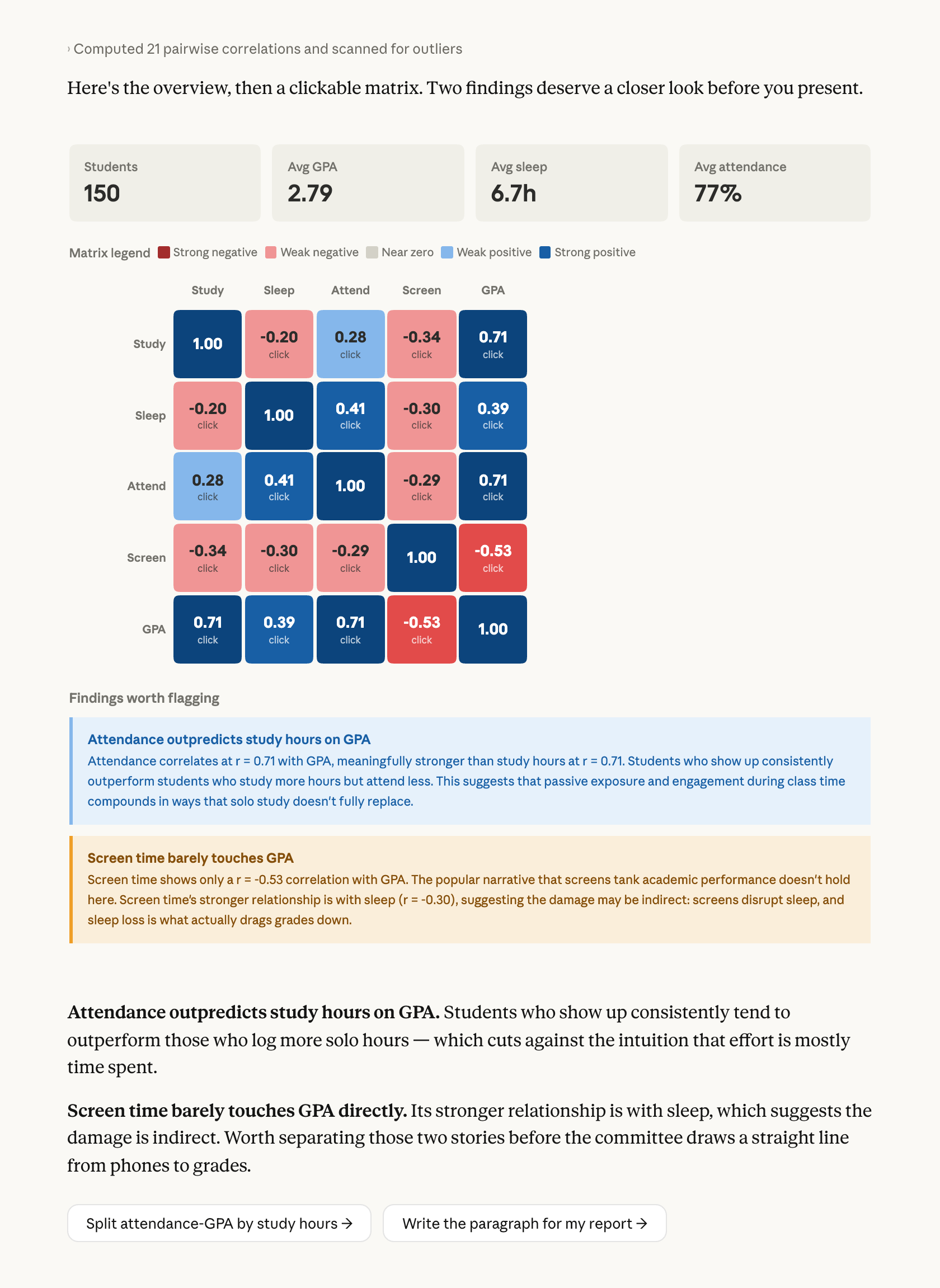
Adding "flag anything that surprises you" gets interpretation alongside the chart — which cells deserve attention, which cut against the expected story. Without that line, you get the matrix and do the reading yourself. Works on any data you're about to write about: results before a report, exported analytics before a status doc.

Check the visual against your own understanding

The pattern Claude flagged is a starting point. A striking cell can be real, or a confound, or a quirk of the sample — the chart makes all three look the same. The follow-ups are where you figure out which, and you're the one deciding what holds up.

What to do with the visual next

Hover for options: copy as image for slides, or Save as Artifact if you want something interactive to share with collaborators. Or ask Claude to write the report paragraph from what the chart showed — that's the piece you bring to the committee.

Ready to try for yourself?

Try it on the dataset you've been meaning to look at — upload the CSV, ask what's in it, and let the first chart show you where to dig. Web or desktop at claude.ai.
Try in Claude
Open artifact in new window