You've read the papers. Each made sense on its own. What gets hard around paper twelve is holding the shape of the whole thing — which papers are building on each other, which are in tension, what each camp is taking for granted. Claude can draw that shape inline as you work through the set: clusters by claim, tension lines where camps disagree, a panel per cluster on what it's missing. The map is one reading of the debate — something to check against your own sense of where the papers sit. Where you'd cluster differently is often where your own argument starts taking shape.
Here a grad student has read twenty papers on AI in K-12 and lost the thread. Claude draws five argument clusters with tension lines between them, and the blind-spot panels give the student something to check against their own sense of the literature.
I've read 20 papers on AI in K-12 and I've lost the thread. Can you map out who's actually agreeing with who and where the real disagreements are? I can't tell anymore which papers are building on each other and which are talking past each other. If I click into a group, give me the short version of what they've got and what they're missing.
Attach the papers or notes. The more of each paper Claude can see — abstract, claims, who's cited — the more the map reflects what's there rather than a generic reading.
Papers or a consolidated notes file.
Connecting Google Drive lets Claude read the papers directly. For a review that runs over weeks, a Project keeps sources available across conversations — drop in a new paper and ask Claude to update the map without re-uploading the rest.
Claude clusters by argument — so the map is a picture of the debate, not a keyword tree. The blind-spot section in each cluster panel is Claude's reading of what that camp consistently undertheorizes, which is the kind of thing you stop seeing once you're inside a literature. The map is a position you check: where it matches your sense of the field, you've confirmed something; where it doesn't, you've found either a place you're wrong or the beginning of your own reading.

Click any element in the map and Claude expands it below — the map stays, the detail opens beneath. Here, a tension line surfaces which papers are in it.
Walk me through the assessment-vs-surveillance tension — which specific claims does the critical camp push back on, and do the analytics papers engage or talk past it?
Claude writes the lit review section using the map as the outline — one paragraph per cluster, one per tension line — and you edit from there.
Draft the "state of the debate" section for my lit review from this map. One paragraph per cluster, then one per tension line.
Tell Claude where you'd draw a boundary differently and it redraws — your correction reshapes the map.
I think the Williamson paper belongs between the analytics and critical camps, not inside analytics. Redraw with it as a bridge and show me what changes about the tension lines.
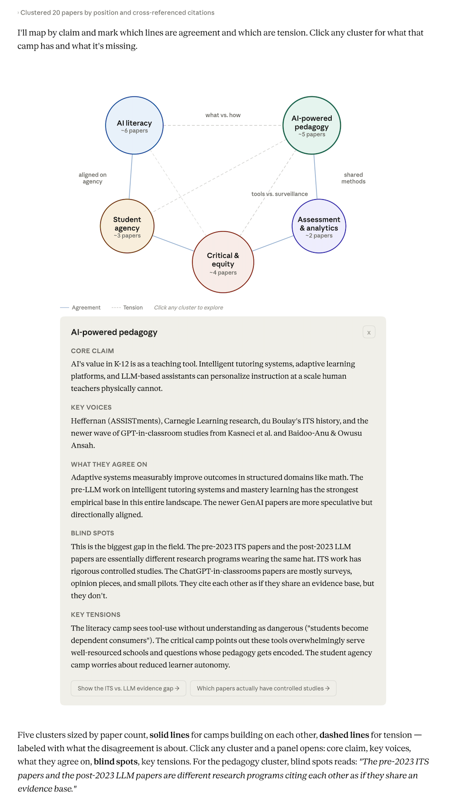
"Who's agreeing with who and where the disagreements are" asks Claude to cluster by argument — that's what gets tension lines. A plain "organize these papers" tends to produce a topic tree; this phrasing produces a map of the debate. Papers on the same subject can sit in opposite camps, and that's what you want to see.
The clusters are Claude's interpretation. If a paper you'd call a bridge ended up firmly in one camp, say so and watch the map adjust. Where you disagree is worth paying attention to — either Claude's read is sharper than yours, or yours is sharper than Claude's, and the second case is an insight you can write up.
Save as Artifact keeps the map live — add a paper next week and redraw without re-uploading the rest. Or ask Claude to write the "state of the debate" section from the clusters. The map is an outline you've tested; the paragraphs come from what it shows.
