Visualize program data
Transform spreadsheets of program statistics into presentation-ready charts, infographics, and dashboards that tell your impact story visually and help demonstrate program satisfaction to stakeholders.
Bring your data to life. Claude's ability to analyze patterns in your program data, combined with professional file creation tools, lets you transform raw statistics into visual stories that move stakeholders to action. Instead of presenting numbers in static spreadsheets, you can generate sophisticated dashboards, trend analyses, and impact visualizations that communicate program satisfaction and organizational performance at a glance.
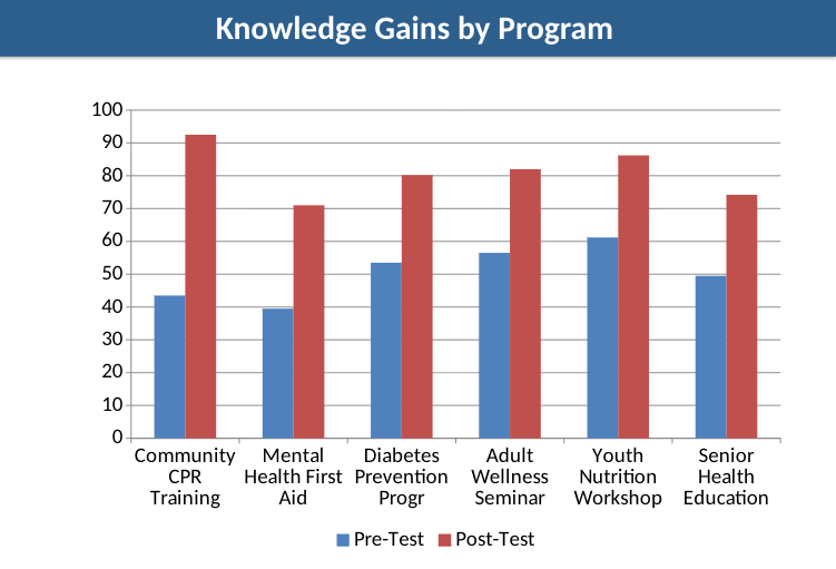
The uploaded CSV contains quarterly metrics for six programs: Youth Nutrition Workshop, Adult Wellness Seminar, Senior Health Education, Community CPR Training, Mental Health First Aid, and Diabetes Prevention Program.
The data includes: participants enrolled and completed, completion rates, satisfaction scores (1-5 scale), Net Promoter Scores, pre/post-test averages, knowledge gains, repeat participants, referrals, volunteer hours, and cost per participant.
I need to create a comprehensive visualization suite for our board meeting next week. Create:
The board cares most about program satisfaction, completion rates, and demonstrable learning outcomes. They want to see which programs perform best and where we're improving quarter over quarter. Make the visualizations clear enough for quick comprehension but detailed enough to support strategic decisions.
Design these with consulting-firm quality and use colors that feel professional but warm (we're a health nonprofit, not a corporate consultancy).
Connect your data sources and enable key features. Provide your program data so Claude can identify patterns, calculate key metrics, and create visualizations that highlight your most important outcomes. Claude will identify missing values, inconsistent formats, and outliers, then suggest fixes before visualization.
Upload your program data as a XLSX or CSV file with columns for metrics you track. Include time periods (quarters, months, years), program names, and the specific measurements that matter to your stakeholders. The more complete your data, the richer Claude's analysis and visualizations.
In addition to the raw data files containing the information you are looking to analyze and discuss, enable the Google Drive integration to provide Claude with more information.
Click the (+) button in the chat bar to browse files that contain additional information you may want to include:
Enable Extended Thinking to improves how Claude analyzes patterns across multiple programs and time periods, resulting in more sophisticated dashboard designs
Make sure code execution and file creation is enabled in settings. This is essential for creating working Excel dashboards with formulas, charts, conditional formatting, and interactive elements.


Think about what supplementary context would help Claude understand your organization's story: previous annual reports showing historical performance, grant proposals with promised outcomes you're now measuring, or board presentation slides demonstrating your current visualization style. These reference materials help Claude match your organization's voice and adapt visualizations to your existing reporting rhythms.
Recommended tools and features:
Claude analyzes your program data to identify trends, calculate performance metrics, and create a comprehensive visualization suite tailored to your stakeholder needs.
Here's what I've created for your board presentation:
1. Excel Dashboard: Wellness_Reach_Program_Visualization_Suite.xlsx
2. PowerPoint Presentation: Wellness_Reach_Impact_Presentation.pptx
Key findings: Your programs achieved a 94% completion rate and 4.7/5.0 satisfaction score across 2,600+ participants. Senior Health Education and Diabetes Prevention Program lead in satisfaction (4.9/5.0). Community CPR Training shows the strongest growth trajectory with 24% enrollment increase from Q1 to Q3. Knowledge gains average 25+ points across all programs, demonstrating measurable learning impact.
Understand which communities you're serving most effectively.
Create an additional analysis sheet showing how satisfaction and completion rates vary by participant age group and zip code. This will help us understand which communities we're serving most effectively.
Generate a deep-dive analysis for a specific program.
Generate a deep-dive PowerPoint specifically for our Mental Health First Aid program. Show quarterly trends, participant testimonial themes, and compare our results to national certification standards.
Use Research mode to find nonprofit sector benchmarks for comparison.
Use Research mode to find nonprofit sector benchmarks for our key metrics. I need comparison points for: donor retention rates for organizations in our budget range ($500K-$1M annual), average gift sizes for similar mission areas, and program satisfaction scores for workforce development nonprofits. Then add these benchmarks as reference lines on our existing charts.
File previews in chat show basic structure but miss the details that make these outputs impressive. The Excel dashboard contains working formulas, conditional formatting with color scales, frozen header rows for easy navigation, and carefully selected typography that doesn't appear in previews. Download and open both files to experience the full professional quality and continue editing with complete fidelity.
Claude's initial outputs establish excellent structure and professional design, but you'll spot opportunities for enhancement once you work with the real files. Request specific improvements: "Tighten the spacing on the trend analysis tab," "Add a chart showing donor acquisition cost over time," or "Include margin notes explaining what each metric means." Each round of targeted feedback produces increasingly polished results.
Claude defaults to professional but conservative aesthetics. When visual impact matters, request elevated design: "Choose a sophisticated color palette with unexpected combinations that still feel trustworthy," "Use premium typography with strong hierarchy—this should look expensive," or "Design like you're preparing this for a major foundation's investment committee." Including phrases like "consulting-grade quality" or "portfolio-worthy execution" in your prompts activates higher design standards.
Board members want financial health and risk indicators. Major donors seek impact narratives and return on investment. Grant officers need evaluation data and sustainability metrics. Staff and volunteers respond to program performance and participant feedback. Before finalizing your visualizations, identify your primary audience and emphasize the metrics that resonate with their priorities.
Start with a single dashboard covering your most important program or campaign. Get comfortable with regular updates. Let it become part of your quarterly routine. Once that feels effortless, expand to additional programs, more sophisticated analysis, or audience-specific reports. Organizations that try to visualize everything simultaneously often abandon the effort when it becomes overwhelming.