> ## Documentation Index
> Fetch the complete documentation index at: https://claude.com/docs/llms.txt
> Use this file to discover all available pages before exploring further.
# Design guidelines
> Visual and interaction design guidelines for MCP Apps in Claude
## Overview
MCP Apps are interactive interfaces that appear within Claude's conversational flow. Think of them as natural extensions of the conversation, not separate apps that happen to appear alongside it. Your app inherits conversational context and helps users accomplish meaningful tasks without breaking flow.
**Core principles:**
* **Conversational.** Fit naturally into dialogue. Don't force users to learn new interaction patterns.
* **Contextual.** Use conversation history to inform what you display and when.
* **Integrated.** Inherit styling and conventions from the containing environment.
* **Adaptive.** Handle variable sizing, mobile viewports, and diverse accessibility needs gracefully.
See our [Figma UI kit](https://www.figma.com/community/file/1597641111449594397/mcp-apps-for-claude) for components and patterns to help you get started.
## What makes a good MCP App
**Good candidates:**
* Tasks that fit naturally into conversation like data analysis, document review, or project coordination
* Communication and collaboration context like message search results, conversation threads, or team member profiles
* Tasks with a clear start and end like booking, ordering or scheduling
* Information users can act on immediately
* Functionality that extends Claude's capabilities meaningfully
**Patterns to avoid:**
* Long-form or static content better suited for external viewing
* Complex multi-step workflows that exceed the display mode's scope
* Deep navigation (no drill-ins, breadcrumbs, or multiple views)
* Nested scrolling (inline cards should auto-fit content height)
* Menus and popovers (dropdowns, context menus, and popover panels can get clipped by container boundaries or create z-index conflicts with the host UI — prefer visible controls like segmented buttons, toggles, or inline options)
* Chat inputs or conversational UI (don't replicate Claude's features)
## Display modes
### Inline card
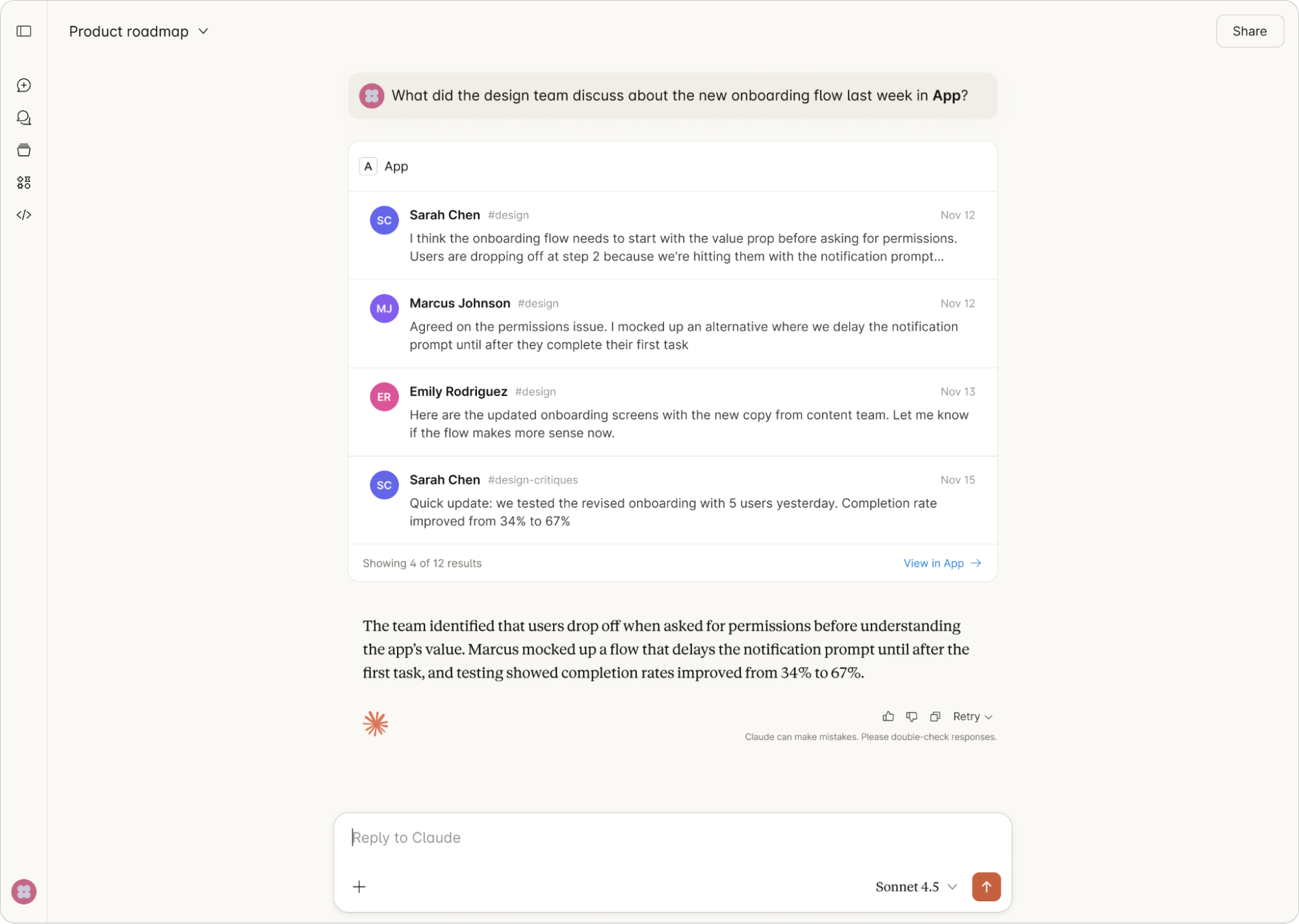
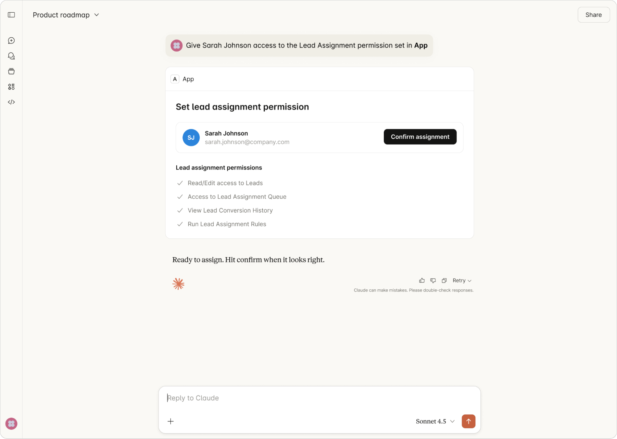
Compact components embedded directly in conversation. Good for summaries, confirmations, and quick actions. Keep them focused.
**When to use:**
* Status updates and confirmations
* Simple data displays or selections
* Brief summaries with optional expansion
* Quick actions that continue the conversation
 **Constraints:**
* Height: auto-fits to content (no nested scrolling)
* Max actions: 2, placed at the bottom of the card
* Max data points: 4-5
* No drill-ins, breadcrumbs, or multiple views
* No menus or popovers — use visible controls instead
**On mobile:** Inline cards render full-width within the conversation. Ensure all tap targets are at least 44pt. Content should adapt to narrower viewports without horizontal scrolling.
**Constraints:**
* Height: auto-fits to content (no nested scrolling)
* Max actions: 2, placed at the bottom of the card
* Max data points: 4-5
* No drill-ins, breadcrumbs, or multiple views
* No menus or popovers — use visible controls instead
**On mobile:** Inline cards render full-width within the conversation. Ensure all tap targets are at least 44pt. Content should adapt to narrower viewports without horizontal scrolling.
 ### Inline carousel
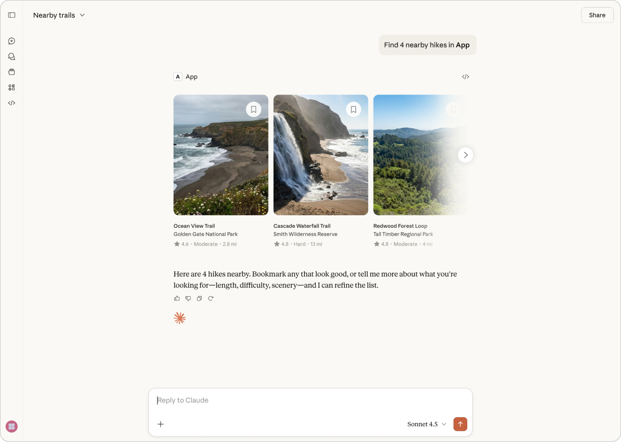
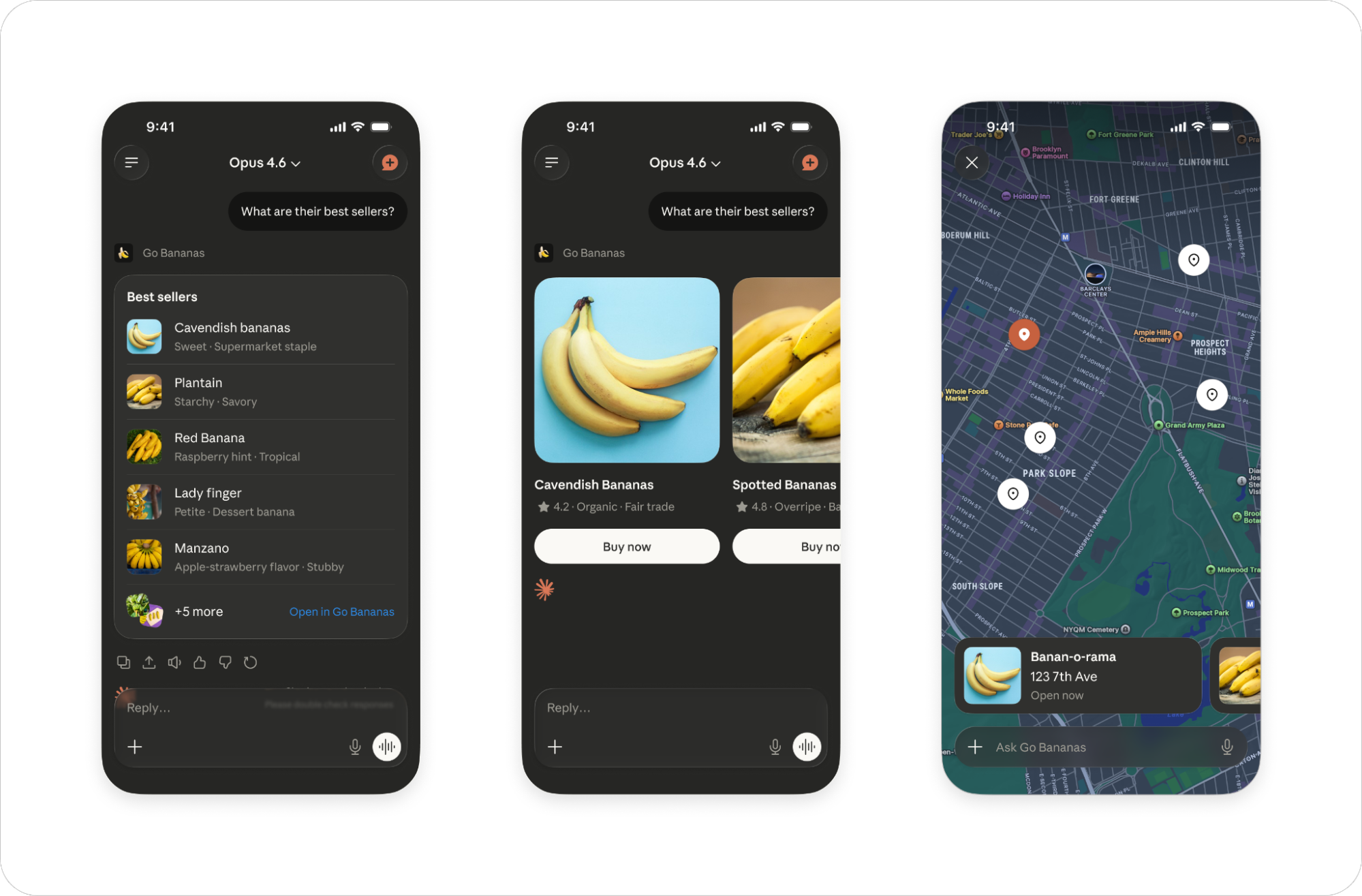
Side-by-side items for browsing options. Users swipe or scroll horizontally to explore.
**When to use:**
* Product listings or search results
* Location or venue options
* Media galleries
* Any set of comparable items
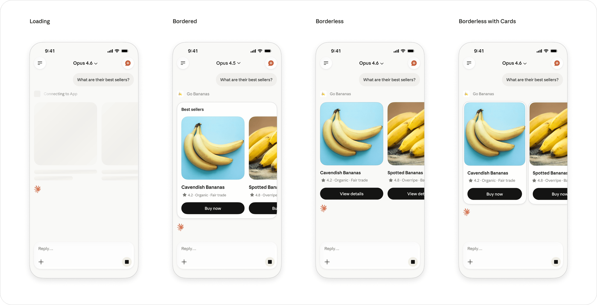
### Inline carousel
Side-by-side items for browsing options. Users swipe or scroll horizontally to explore.
**When to use:**
* Product listings or search results
* Location or venue options
* Media galleries
* Any set of comparable items
 **Constraints:**
* 3-8 items for scannability
* Each card: image + title + metadata (max 3 lines) + optional CTA
* 1 optional CTA per card
* Maintain consistent card dimensions within a carousel
* Cards should have consistent visual hierarchy
**On mobile:** Carousel cards are optimized for horizontal swipe. Design for thumb reach — keep primary actions in the lower portion of cards. Peek the next card to signal scrollability.
**Constraints:**
* 3-8 items for scannability
* Each card: image + title + metadata (max 3 lines) + optional CTA
* 1 optional CTA per card
* Maintain consistent card dimensions within a carousel
* Cards should have consistent visual hierarchy
**On mobile:** Carousel cards are optimized for horizontal swipe. Design for thumb reach — keep primary actions in the lower portion of cards. Peek the next card to signal scrollability.
 ### Full screen
Immersive interfaces for complex interactions. The conversation composer remains available so users can continue talking to your app through Claude. Apps provide their own fullscreen button. A close button appears in the native header bar when in fullscreen mode. In fullscreen mode, avoid the use of floating panels. Use collapsible sidebars, tabs or pagination to disclose details.
**When to use:**
* Data visualizations and dashboards
* Detailed analysis tools
* Document editing
* Content that benefits from focused attention
* Rich tasks requiring more space than inline allows
### Full screen
Immersive interfaces for complex interactions. The conversation composer remains available so users can continue talking to your app through Claude. Apps provide their own fullscreen button. A close button appears in the native header bar when in fullscreen mode. In fullscreen mode, avoid the use of floating panels. Use collapsible sidebars, tabs or pagination to disclose details.
**When to use:**
* Data visualizations and dashboards
* Detailed analysis tools
* Document editing
* Content that benefits from focused attention
* Rich tasks requiring more space than inline allows
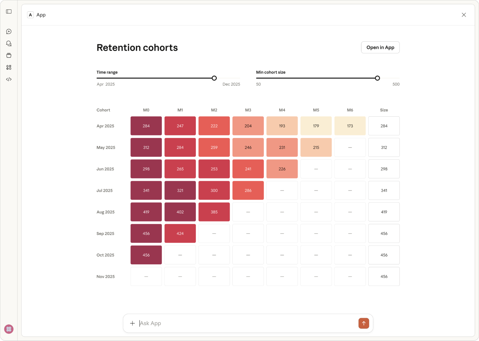
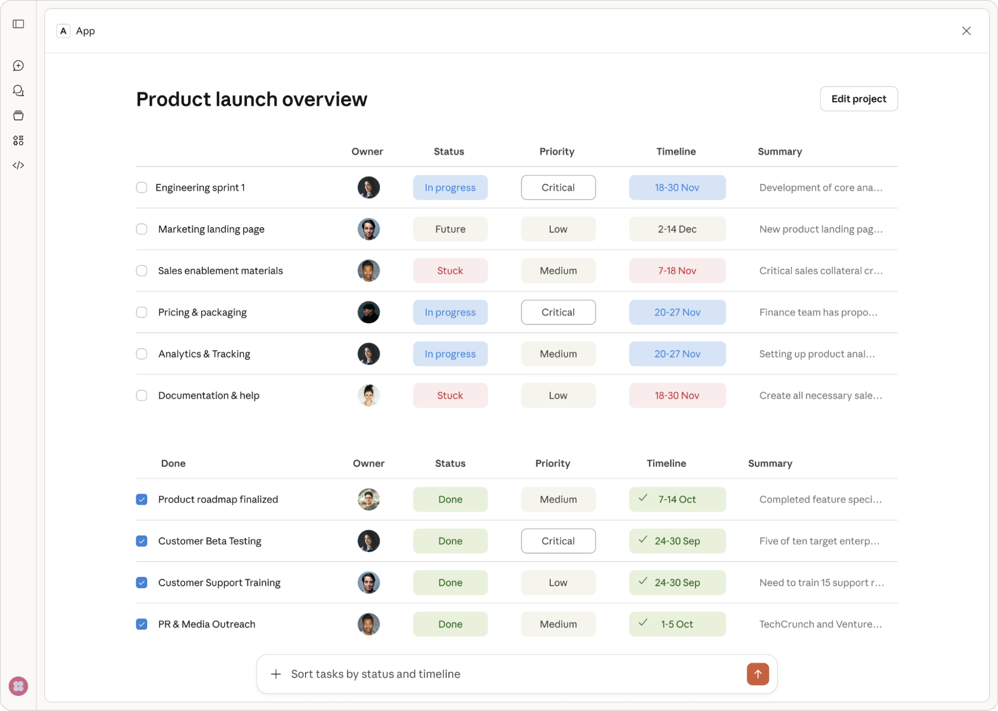 **Constraints:**
* Your app provides its own fullscreen button; a close button appears in the native header bar
* The composer is always visible — design your UX to work with it
* No floating panels — use collapsible sidebars, tabs, or pagination to disclose details
* Chat sheet maintains conversational context
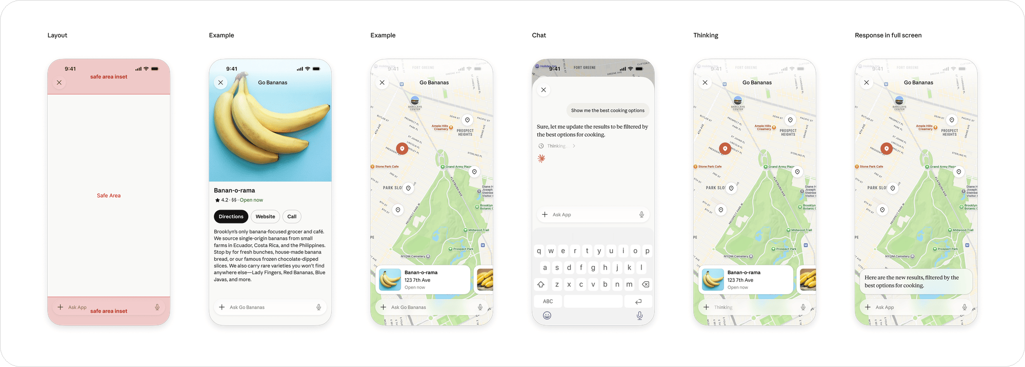
**On mobile:** Your app fills the entire screen with the chat input and navigation bar overlaid on top, so keep critical UI within the safe area. Use the full viewport width and support both portrait and landscape where it makes sense.
**Constraints:**
* Your app provides its own fullscreen button; a close button appears in the native header bar
* The composer is always visible — design your UX to work with it
* No floating panels — use collapsible sidebars, tabs, or pagination to disclose details
* Chat sheet maintains conversational context
**On mobile:** Your app fills the entire screen with the chat input and navigation bar overlaid on top, so keep critical UI within the safe area. Use the full viewport width and support both portrait and landscape where it makes sense.
 ## Mobile guidelines
MCP apps on mobile share the same principles as web, but the constrained viewport and touch-based interaction require specific adaptations.
On mobile, Claude renders apps in a native WebView (WKWebView on iOS, WebView on Android) rather than a sandboxed iframe. Current mobile-only constraints: no camera/mic/location access, and connectors must be added via web or desktop before they appear on mobile.
### Host context for layout
The host passes layout hints via `hostContext`.
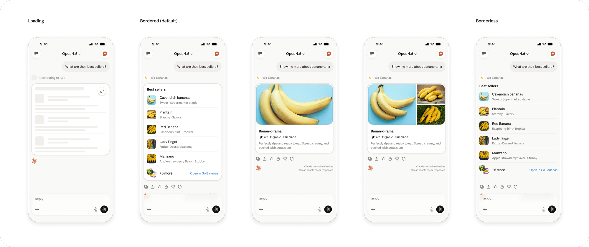
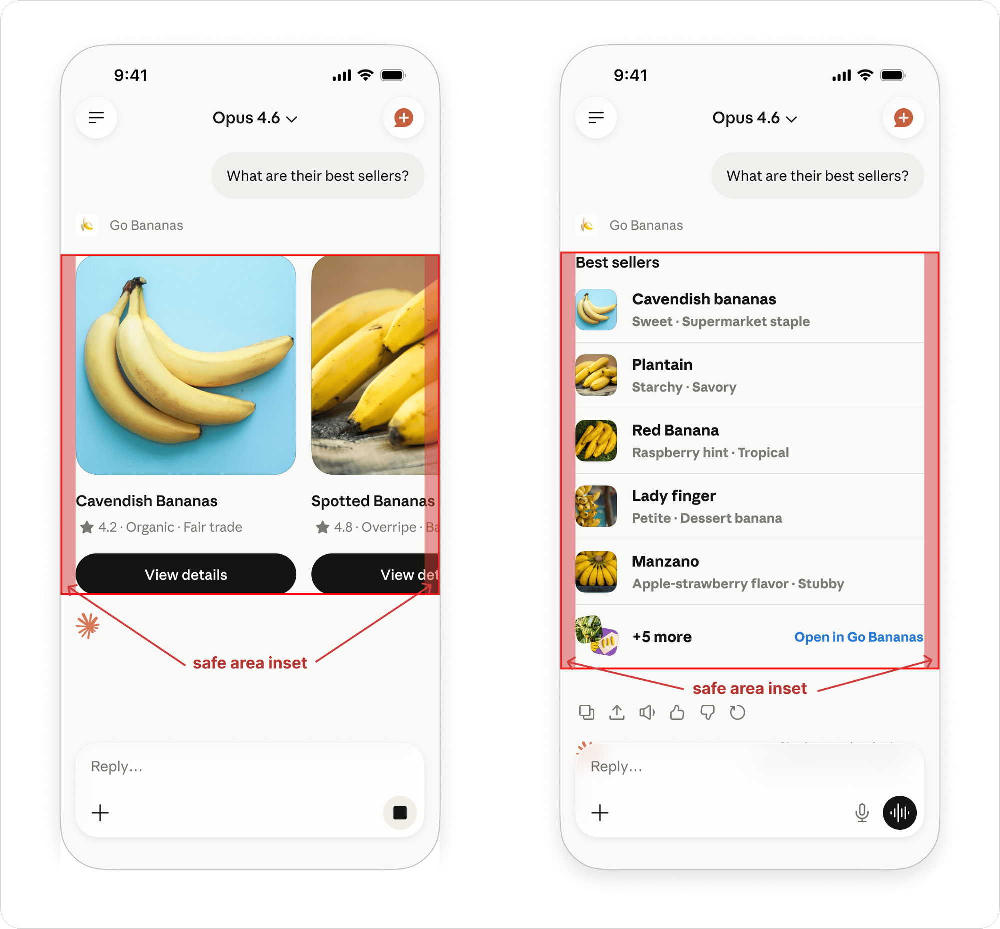
**Safe areas.** The interactive portion of your app should be rendered inside of the safe area to ensure it's not obscured by the mobile navigation bar or chat input and respects the chat screen's content margins. The user won't be able to interact with anything rendered outside the safe area (e.g. buttons obscured by a mobile navigation bar). Read `hostContext.safeAreaInsets.{top, right, bottom, left}` (in pixels) and apply them as padding on your root container, or as `scroll-padding` on scroll-snap containers so items come to rest inside the visible region. Safe areas are not mobile-specific: on web and desktop the composer can overlay the bottom of an inline app, so avoid placing interactive controls flush against any edge.
## Mobile guidelines
MCP apps on mobile share the same principles as web, but the constrained viewport and touch-based interaction require specific adaptations.
On mobile, Claude renders apps in a native WebView (WKWebView on iOS, WebView on Android) rather than a sandboxed iframe. Current mobile-only constraints: no camera/mic/location access, and connectors must be added via web or desktop before they appear on mobile.
### Host context for layout
The host passes layout hints via `hostContext`.
**Safe areas.** The interactive portion of your app should be rendered inside of the safe area to ensure it's not obscured by the mobile navigation bar or chat input and respects the chat screen's content margins. The user won't be able to interact with anything rendered outside the safe area (e.g. buttons obscured by a mobile navigation bar). Read `hostContext.safeAreaInsets.{top, right, bottom, left}` (in pixels) and apply them as padding on your root container, or as `scroll-padding` on scroll-snap containers so items come to rest inside the visible region. Safe areas are not mobile-specific: on web and desktop the composer can overlay the bottom of an inline app, so avoid placing interactive controls flush against any edge.
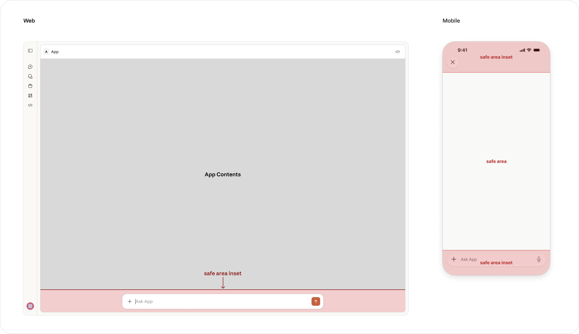 **Borderless inline.** Set `_meta.ui.prefersBorder` to true or false to explicitly determine whether your content should render with a border. If no value is specified, content will be rendered borderless on web and bordered on mobile. In borderless mode your content runs edge-to-edge with no host padding, so honoring `safeAreaInsets` becomes essential; the bordered card's built-in padding otherwise absorbs most of them. Borderless works well for carousels and other horizontally-scrolling content that should bleed to the screen edges while in motion: apply `safeAreaInsets.left` and `.right` as `scroll-padding-inline` on the scroll container so items at rest sit clear of the device edges, but can scroll underneath them.
 Apps always fill the container width—there are no fixed breakpoints. Design responsively from 320px up to fullscreen using container queries and the hostContext CSS variables.
### Display modes
Declare which modes your app supports via `appCapabilities.availableDisplayModes` in `ui/initialize`. The host responds with the modes it supports, and your app can request a switch with `ui/request-display-mode`. Modes are `inline`, `fullscreen`, and `pip`.
### Content security policy
Declare external origins per `ui://` resource via `_meta.ui.csp`:
```json theme={null}
{
"_meta": {
"ui": {
"csp": {
"connectDomains": ["https://api.example.com"],
"resourceDomains": ["https://cdn.example.com"],
"baseUriDomains": []
}
}
}
}
```
By default, all external origins are blocked. `frameDomains` (embedding third-party iframes) is currently restricted in Claude pending security review.
### Viewport and layout
* Design for variable widths (320pt minimum, up to tablet)
* Respect safe areas on notched devices
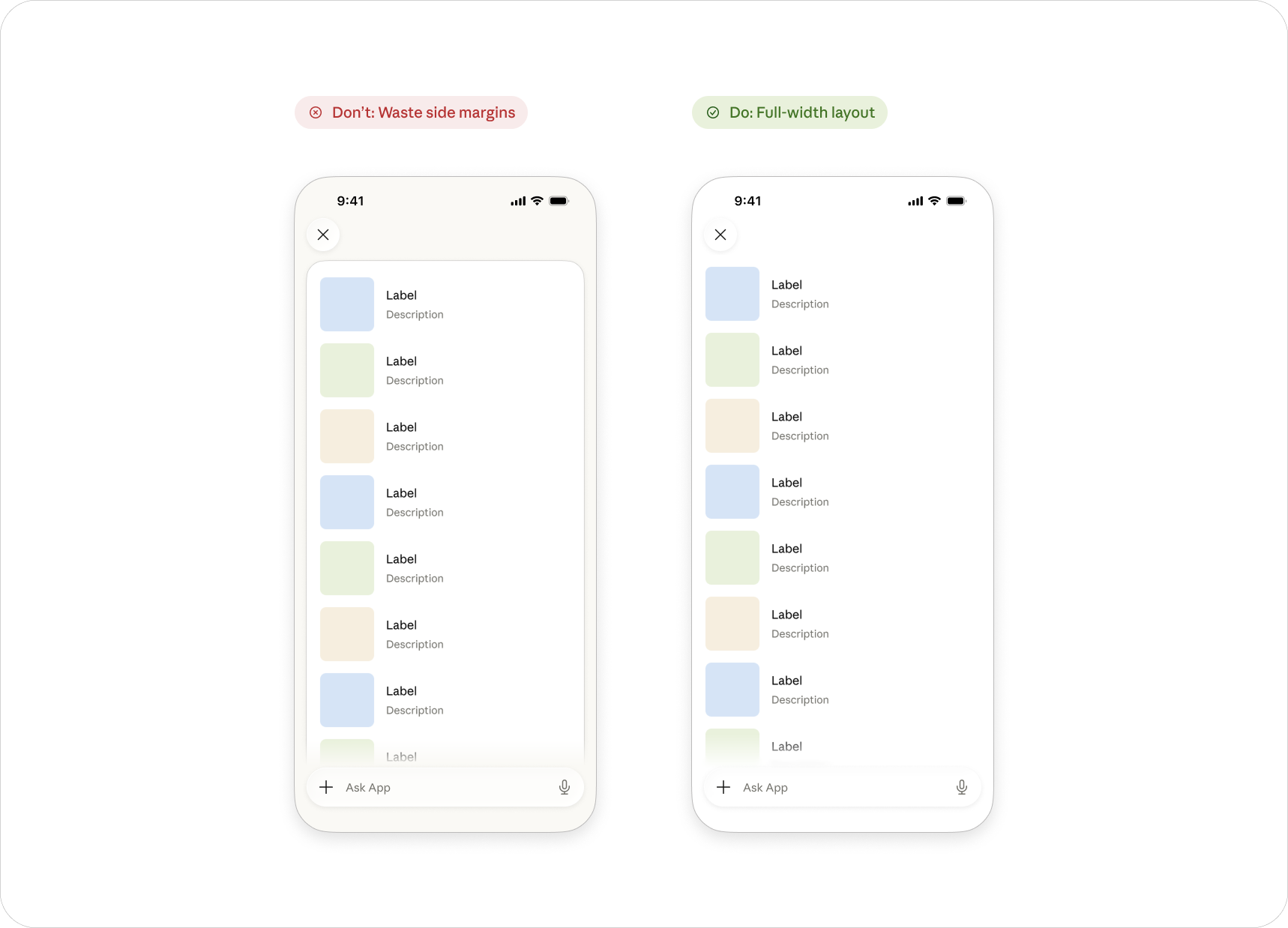
* Full-width layouts — don't add side margins that waste mobile screen real estate
* Content should reflow gracefully; avoid fixed-width layouts
Apps always fill the container width—there are no fixed breakpoints. Design responsively from 320px up to fullscreen using container queries and the hostContext CSS variables.
### Display modes
Declare which modes your app supports via `appCapabilities.availableDisplayModes` in `ui/initialize`. The host responds with the modes it supports, and your app can request a switch with `ui/request-display-mode`. Modes are `inline`, `fullscreen`, and `pip`.
### Content security policy
Declare external origins per `ui://` resource via `_meta.ui.csp`:
```json theme={null}
{
"_meta": {
"ui": {
"csp": {
"connectDomains": ["https://api.example.com"],
"resourceDomains": ["https://cdn.example.com"],
"baseUriDomains": []
}
}
}
}
```
By default, all external origins are blocked. `frameDomains` (embedding third-party iframes) is currently restricted in Claude pending security review.
### Viewport and layout
* Design for variable widths (320pt minimum, up to tablet)
* Respect safe areas on notched devices
* Full-width layouts — don't add side margins that waste mobile screen real estate
* Content should reflow gracefully; avoid fixed-width layouts
 ### Touch targets
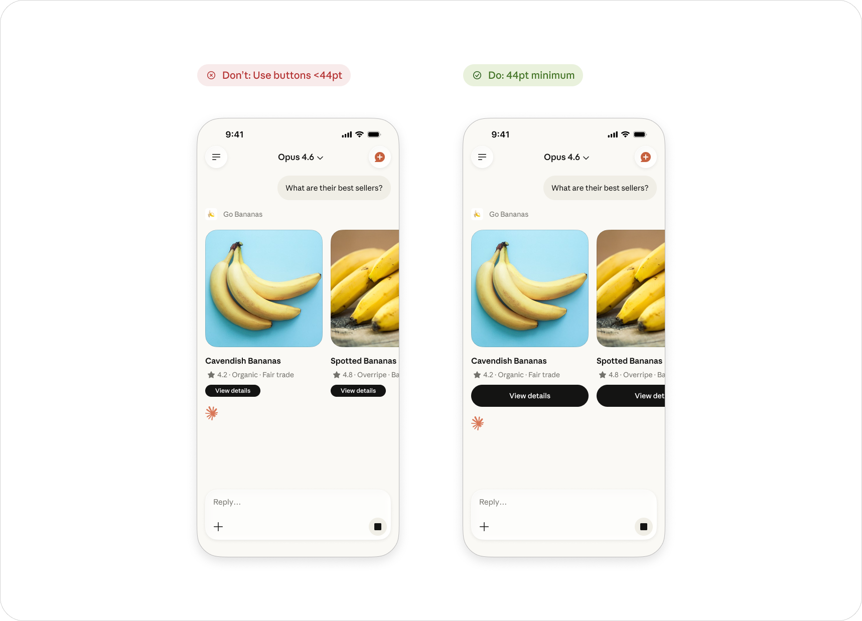
* Minimum tap target: 44 x 44pt (per Apple HIG / Material guidelines)
* Add sufficient spacing between interactive elements to prevent mis-taps
* Prefer larger, thumb-friendly buttons over small text links
* Place primary actions within natural thumb reach (lower portion of screen)
### Touch targets
* Minimum tap target: 44 x 44pt (per Apple HIG / Material guidelines)
* Add sufficient spacing between interactive elements to prevent mis-taps
* Prefer larger, thumb-friendly buttons over small text links
* Place primary actions within natural thumb reach (lower portion of screen)
 ### Scrolling and gestures
On mobile touch devices, the conversation view owns vertical scrolling. When your app is rendered inline, vertical pan gestures that start inside it are passed to the conversation scroll instead of to your content. This keeps a tall widget from trapping the user and is why inline apps should fit their content height rather than relying on an internal vertical scroll container—the host caps inline height and clips content that exceeds it.
Horizontal gestures (ex: carousels or panning a map) and taps work normally.
If your app genuinely needs its own vertically scrollable viewport, request fullscreen presentation with `ui/request-display-mode` instead of rendering inline (see [Full screen](#full-screen)).
### Transitions
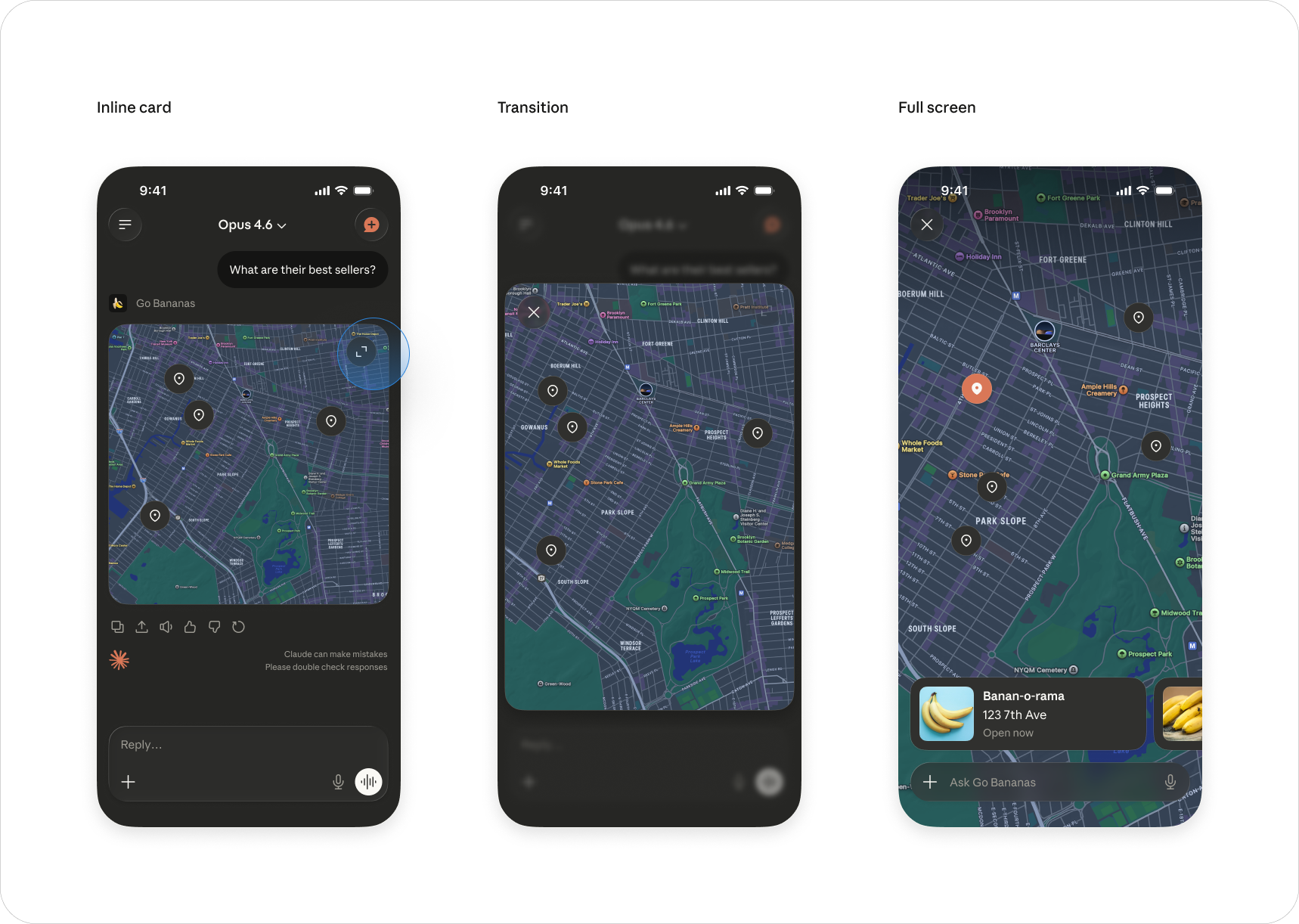
* Inline cards expand to fullscreen with a smooth transition
* Provide a clear visual affordance for expansion (fullscreen button or tap-to-expand)
* Fullscreen close returns to the conversation at the same scroll position
### Scrolling and gestures
On mobile touch devices, the conversation view owns vertical scrolling. When your app is rendered inline, vertical pan gestures that start inside it are passed to the conversation scroll instead of to your content. This keeps a tall widget from trapping the user and is why inline apps should fit their content height rather than relying on an internal vertical scroll container—the host caps inline height and clips content that exceeds it.
Horizontal gestures (ex: carousels or panning a map) and taps work normally.
If your app genuinely needs its own vertically scrollable viewport, request fullscreen presentation with `ui/request-display-mode` instead of rendering inline (see [Full screen](#full-screen)).
### Transitions
* Inline cards expand to fullscreen with a smooth transition
* Provide a clear visual affordance for expansion (fullscreen button or tap-to-expand)
* Fullscreen close returns to the conversation at the same scroll position
 ### Dark mode
All views must support both light and dark themes. Use the host's style tokens — they automatically adapt. Never hardcode colors. Test both modes.
### Dark mode
All views must support both light and dark themes. Use the host's style tokens — they automatically adapt. Never hardcode colors. Test both modes.
 ### Loading states
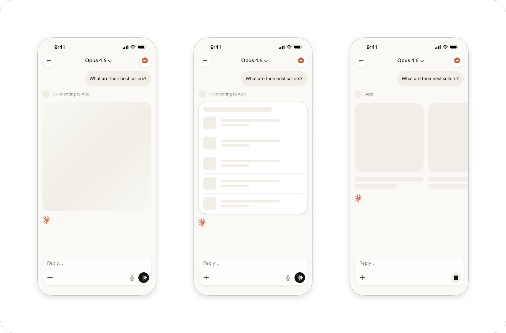
Show skeleton screens while content loads. Match the layout structure of the final content so the transition feels seamless. Avoid spinners for inline content — skeletons feel more native.
### Loading states
Show skeleton screens while content loads. Match the layout structure of the final content so the transition feels seamless. Avoid spinners for inline content — skeletons feel more native.
 ## Visual design
MCP Apps should feel native to their environment while maintaining consistent visual hierarchy and accessibility standards. You can still express your brand through accent colors, custom controls and content.
**Design guidance**
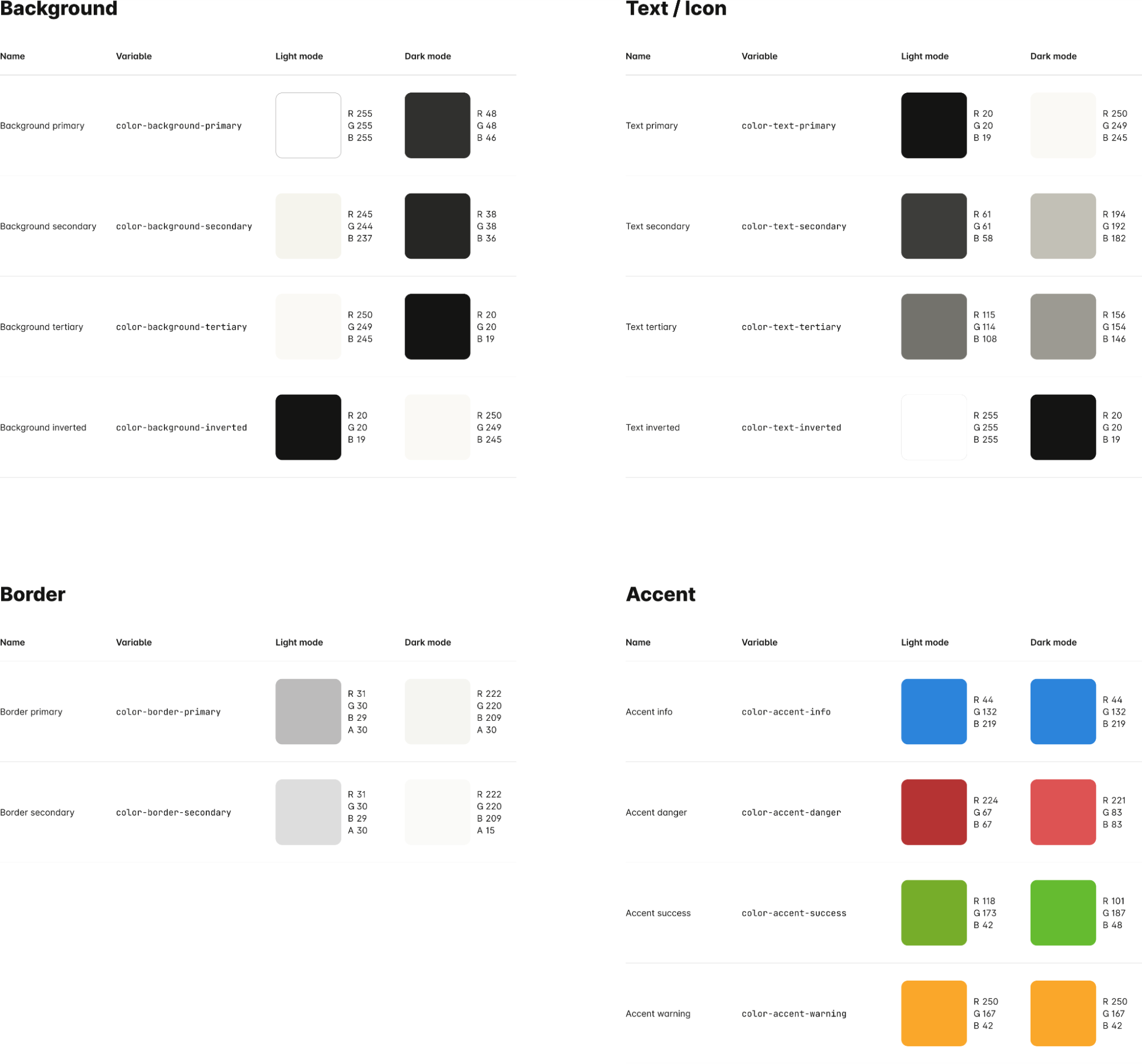
**Color.** Use host tokens for all structural elements: backgrounds, text, borders, icons. You can use your own brand colors for accents and identity, but the core UI should use the provided palette.
## Visual design
MCP Apps should feel native to their environment while maintaining consistent visual hierarchy and accessibility standards. You can still express your brand through accent colors, custom controls and content.
**Design guidance**
**Color.** Use host tokens for all structural elements: backgrounds, text, borders, icons. You can use your own brand colors for accents and identity, but the core UI should use the provided palette.
 **Typography.** Stick to the three-level size scale (heading, body, caption) and two weights (regular, emphasized). This creates clear hierarchy without visual noise.
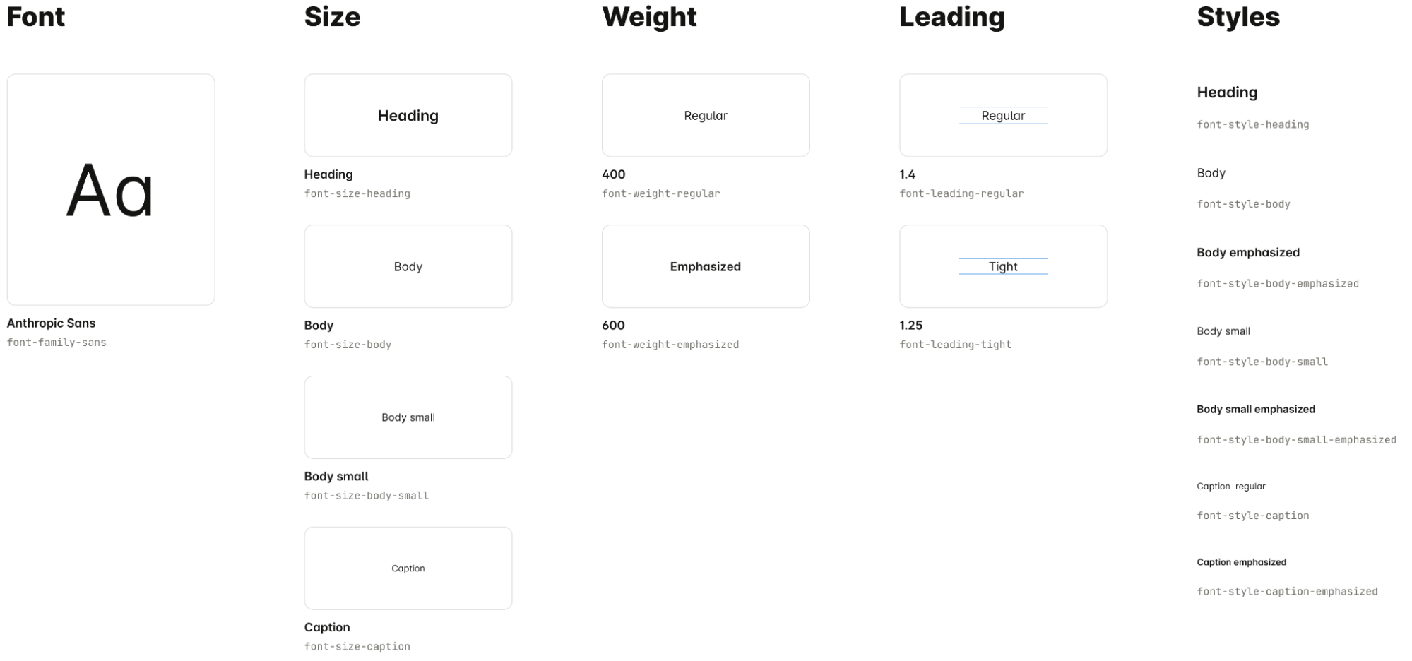 The Figma Community File uses Anthropic Sans and Anthropic Serif. When your app runs inside Claude, the host client provides Anthropic Sans at runtime through style variables. [Download and install the fonts from here](https://brand.anthropic.com/typography) for local development.
**Borders.** Using a limited set of corner radii and thickness will keep your app feeling native to the surrounding UI.
The Figma Community File uses Anthropic Sans and Anthropic Serif. When your app runs inside Claude, the host client provides Anthropic Sans at runtime through style variables. [Download and install the fonts from here](https://brand.anthropic.com/typography) for local development.
**Borders.** Using a limited set of corner radii and thickness will keep your app feeling native to the surrounding UI.
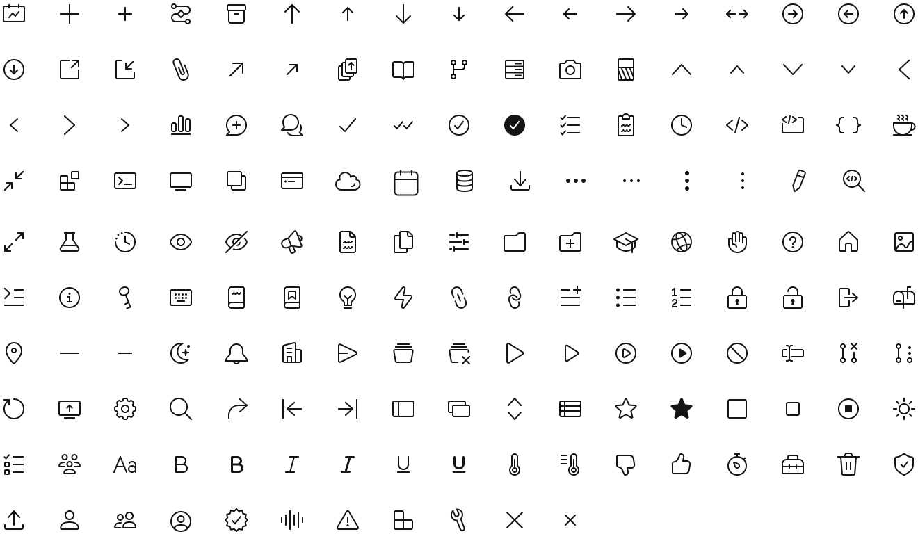
 **Icons.** Use monochromatic, outlined icons that match the host's icon color tokens. Icons should support understanding, not be essential to it.
 **Spacing.** Maintain generous padding and logical groupings. Balance information density with readability, adapting to viewport constraints.
## Interaction patterns
### App vs. chat interactions
Understanding the boundary between your app's interactions and Claude's conversational interface helps you build something that feels cohesive.
**Handle within your app:**
* Direct manipulation like sliders, toggles, and selections
* Filtering or sorting data you're already displaying
* Expanding and collapsing content sections
* Confirming or executing a prepared action ("Mark complete," "Send," "Save")
* Interacting with visualizations like hover states or clicking data points
Prefer controls with visible options (segmented buttons, toggle chips, inline tabs) over menus and dropdowns, which can conflict with the host container.
**Push to chat input:**
* Text entry and freeform input
* Follow-up questions or requests for clarification
* Requests to modify, refine, or redo something
* Navigation to different contexts or topics
* Anything that benefits from Claude's interpretation
If the interaction requires language understanding or generates a response from Claude, it goes through chat. If it's a direct UI action on content your app already controls, handle it in the app.
### Start simple
Reveal complexity only when users need it. The inline card might show a summary; fullscreen mode can offer the detailed view.
### Visible controls over hidden menus
Prefer controls with visible options (segmented buttons, toggle chips, inline tabs) over menus and dropdowns. Menus conflict with the host container and are harder to use on mobile.
## Accessibility
Maintain high contrast standards (WCAG AA minimum). Support keyboard navigation and provide text alternatives for visual content. Test with assistive technologies. Your app must be usable by everyone.
## Style variables
MCP Apps automatically receive style variables from the host client. Reference these CSS custom properties to create interfaces that feel native to Claude.
**Color tokens** cover backgrounds, text, and borders. Semantic accent colors signal status. All tokens automatically adapt to light and dark mode.
| | Light mode | Dark mode |
| :--------------------------- | :-------------- | :-------------- |
| **Background** | | |
| `color-background-primary` | `#FFFFFF` | `#30302E` |
| `color-background-secondary` | `#F5F4ED` | `#262624` |
| `color-background-tertiary` | `#FAF9F5` | `#141413` |
| `color-background-inverse` | `#141413` | `#FAF9F5` |
| `color-background-ghost` | `#FFFFFF (0%)` | `#30302E (0%)` |
| `color-background-info` | `#D6E4F6` | `#253E5F` |
| `color-background-danger` | `#F7ECEC` | `#602A28` |
| `color-background-success` | `#E9F1DC` | `#1B4614` |
| `color-background-warning` | `#F6EEDF` | `#483A0F` |
| `color-background-disabled` | `#FFFFFF (50%)` | `#30302E (50%)` |
| **Text** | | |
| `color-text-primary` | `#141413` | `#FAF9F5` |
| `color-text-secondary` | `#3D3D3A` | `#C2C0B6` |
| `color-text-tertiary` | `#73726C` | `#9C9A92` |
| `color-text-inverse` | `#FFFFFF` | `#141413` |
| `color-text-ghost` | `#73726C (50%)` | `#9C9A92 (50%)` |
| `color-text-info` | `#3266AD` | `#80AADD` |
| `color-text-danger` | `#7F2C28` | `#EE8884` |
| `color-text-success` | `#265B19` | `#7AB948` |
| `color-text-warning` | `#5A4815` | `#D1A041` |
| `color-text-disabled` | `#141413 (50%)` | `#FAF9F5 (50%)` |
| **Border** | | |
| `color-border-primary` | `#1F1E1D (40%)` | `#DEDCD1 (40%)` |
| `color-border-secondary` | `#1F1E1D (30%)` | `#DEDCD1 (30%)` |
| `color-border-tertiary` | `#1F1E1D (15%)` | `#DEDCD1 (15%)` |
| `color-border-inverse` | `#FFFFFF (30%)` | `#141413 (15%)` |
| `color-border-ghost` | `#1F1E1D (0%)` | `#DEDCD1 (0%)` |
| `color-border-info` | `#4682D5` | `#4682D5` |
| `color-border-danger` | `#A73D39` | `#CD5C58` |
| `color-border-success` | `#437426` | `#599130` |
| `color-border-warning` | `#805C1F` | `#A87829` |
| `color-border-disabled` | `#1F1E1D (10%)` | `#DEDCD1 (10%)` |
| **Ring** | | |
| `color-ring-primary` | `#141413 (70%)` | `#FAF9F5 (70%)` |
| `color-ring-secondary` | `#3D3D3A (70%)` | `#C2C0B6 (70%)` |
| `color-ring-inverse` | `#FFFFFF (70%)` | `#141413 (70%)` |
| `color-ring-info` | `#3266AD (50%)` | `#80AADD (50%)` |
| `color-ring-danger` | `#A73D39 (50%)` | `#CD5C58 (50%)` |
| `color-ring-success` | `#437426 (50%)` | `#599130 (50%)` |
| `color-ring-warning` | `#805C1F (50%)` | `#A87829 (50%)` |
**Typography tokens** include the font family, sizes, weights and line heights.
| Family | |
| :----------------------------- | :----------------------------- |
| `font-sans` | `"Anthropic Sans, sans-serif"` |
| `font-mono` | `"ui-monospace, monospace"` |
| **Weight** | |
| `font-weight-normal` | `400` |
| `font-weight-medium` | `500` |
| `font-weight-semibold` | `600` |
| `font-weight-bold` | `700` |
| **Size** | |
| `font-text-xs-size` | `12px` |
| `font-text-sm-size` | `14px` |
| `font-text-md-size` | `16px` |
| `font-text-lg-size` | `20px` |
| `font-heading-xs-size` | `12px` |
| `font-heading-sm-size` | `14px` |
| `font-heading-md-size` | `16px` |
| `font-heading-lg-size` | `20px` |
| `font-heading-xl-size` | `24px` |
| `font-heading-2xl-size` | `28px` |
| `font-heading-3xl-size` | `36px` |
| **Line-height** | |
| `font-text-xs-line-height` | `1.4` |
| `font-text-sm-line-height` | `1.4` |
| `font-text-md-line-height` | `1.4` |
| `font-text-lg-line-height` | `1.25` |
| `font-heading-xs-line-height` | `1.4` |
| `font-heading-sm-line-height` | `1.4` |
| `font-heading-md-line-height` | `1.4` |
| `font-heading-lg-line-height` | `1.25` |
| `font-heading-xl-line-height` | `1.25` |
| `font-heading-2xl-line-height` | `1.1` |
| `font-heading-3xl-line-height` | `1` |
**Radius tokens** provide border radius values
| Radius | |
| :------------------- | :------- |
| `border-radius-xs` | `4px` |
| `border-radius-sm` | `6px` |
| `border-radius-md` | `8px` |
| `border-radius-lg` | `10px` |
| `border-radius-xl` | `12px` |
| `border-radius-full` | `9999px` |
**Border width tokens** provide width values
| | |
| :--------------------- | :------ |
| `border-width-regular` | `0.5px` |
**Shadow tokens** provide drop-shadow values
| | |
| :---------------- | :----------------------------------------------------------------------- |
| `shadow-hairline` | `0 1px 2px 0 rgba(0, 0, 0, 0.05)` |
| `shadow-sm` | `0 1px 3px 0 rgba(0, 0, 0, 0.1), 0 1px 2px -1px rgba(0, 0, 0, 0.1)` |
| `shadow-md` | `0 4px 6px -1px rgba(0, 0, 0, 0.1), 0 2px 4px -2px rgba(0, 0, 0, 0.1)` |
| `shadow-lg` | `0 10px 15px -3px rgba(0, 0, 0, 0.1), 0 4px 6px -4px rgba(0, 0, 0, 0.1)` |
### Example usage
```css theme={null}
.my-app {
background: var(--color-background-primary);
color: var(--color-text-primary);
font-size: var(--font-text-md-size);
line-height: var(--font-text-md-line-height);
}
.card {
background: var(--color-background-secondary);
border-color: var(--color-border-primary);
border-width: var(--border-width-regular);
border-radius: var(--border-radius-md);
}
.button {
background: var(--color-background-inverse);
color: var(--color-text-inverse);
font-weight: var(--font-weight-semibold);
border-radius: var(--border-radius-md);
}
```
**Spacing.** Maintain generous padding and logical groupings. Balance information density with readability, adapting to viewport constraints.
## Interaction patterns
### App vs. chat interactions
Understanding the boundary between your app's interactions and Claude's conversational interface helps you build something that feels cohesive.
**Handle within your app:**
* Direct manipulation like sliders, toggles, and selections
* Filtering or sorting data you're already displaying
* Expanding and collapsing content sections
* Confirming or executing a prepared action ("Mark complete," "Send," "Save")
* Interacting with visualizations like hover states or clicking data points
Prefer controls with visible options (segmented buttons, toggle chips, inline tabs) over menus and dropdowns, which can conflict with the host container.
**Push to chat input:**
* Text entry and freeform input
* Follow-up questions or requests for clarification
* Requests to modify, refine, or redo something
* Navigation to different contexts or topics
* Anything that benefits from Claude's interpretation
If the interaction requires language understanding or generates a response from Claude, it goes through chat. If it's a direct UI action on content your app already controls, handle it in the app.
### Start simple
Reveal complexity only when users need it. The inline card might show a summary; fullscreen mode can offer the detailed view.
### Visible controls over hidden menus
Prefer controls with visible options (segmented buttons, toggle chips, inline tabs) over menus and dropdowns. Menus conflict with the host container and are harder to use on mobile.
## Accessibility
Maintain high contrast standards (WCAG AA minimum). Support keyboard navigation and provide text alternatives for visual content. Test with assistive technologies. Your app must be usable by everyone.
## Style variables
MCP Apps automatically receive style variables from the host client. Reference these CSS custom properties to create interfaces that feel native to Claude.
**Color tokens** cover backgrounds, text, and borders. Semantic accent colors signal status. All tokens automatically adapt to light and dark mode.
| | Light mode | Dark mode |
| :--------------------------- | :-------------- | :-------------- |
| **Background** | | |
| `color-background-primary` | `#FFFFFF` | `#30302E` |
| `color-background-secondary` | `#F5F4ED` | `#262624` |
| `color-background-tertiary` | `#FAF9F5` | `#141413` |
| `color-background-inverse` | `#141413` | `#FAF9F5` |
| `color-background-ghost` | `#FFFFFF (0%)` | `#30302E (0%)` |
| `color-background-info` | `#D6E4F6` | `#253E5F` |
| `color-background-danger` | `#F7ECEC` | `#602A28` |
| `color-background-success` | `#E9F1DC` | `#1B4614` |
| `color-background-warning` | `#F6EEDF` | `#483A0F` |
| `color-background-disabled` | `#FFFFFF (50%)` | `#30302E (50%)` |
| **Text** | | |
| `color-text-primary` | `#141413` | `#FAF9F5` |
| `color-text-secondary` | `#3D3D3A` | `#C2C0B6` |
| `color-text-tertiary` | `#73726C` | `#9C9A92` |
| `color-text-inverse` | `#FFFFFF` | `#141413` |
| `color-text-ghost` | `#73726C (50%)` | `#9C9A92 (50%)` |
| `color-text-info` | `#3266AD` | `#80AADD` |
| `color-text-danger` | `#7F2C28` | `#EE8884` |
| `color-text-success` | `#265B19` | `#7AB948` |
| `color-text-warning` | `#5A4815` | `#D1A041` |
| `color-text-disabled` | `#141413 (50%)` | `#FAF9F5 (50%)` |
| **Border** | | |
| `color-border-primary` | `#1F1E1D (40%)` | `#DEDCD1 (40%)` |
| `color-border-secondary` | `#1F1E1D (30%)` | `#DEDCD1 (30%)` |
| `color-border-tertiary` | `#1F1E1D (15%)` | `#DEDCD1 (15%)` |
| `color-border-inverse` | `#FFFFFF (30%)` | `#141413 (15%)` |
| `color-border-ghost` | `#1F1E1D (0%)` | `#DEDCD1 (0%)` |
| `color-border-info` | `#4682D5` | `#4682D5` |
| `color-border-danger` | `#A73D39` | `#CD5C58` |
| `color-border-success` | `#437426` | `#599130` |
| `color-border-warning` | `#805C1F` | `#A87829` |
| `color-border-disabled` | `#1F1E1D (10%)` | `#DEDCD1 (10%)` |
| **Ring** | | |
| `color-ring-primary` | `#141413 (70%)` | `#FAF9F5 (70%)` |
| `color-ring-secondary` | `#3D3D3A (70%)` | `#C2C0B6 (70%)` |
| `color-ring-inverse` | `#FFFFFF (70%)` | `#141413 (70%)` |
| `color-ring-info` | `#3266AD (50%)` | `#80AADD (50%)` |
| `color-ring-danger` | `#A73D39 (50%)` | `#CD5C58 (50%)` |
| `color-ring-success` | `#437426 (50%)` | `#599130 (50%)` |
| `color-ring-warning` | `#805C1F (50%)` | `#A87829 (50%)` |
**Typography tokens** include the font family, sizes, weights and line heights.
| Family | |
| :----------------------------- | :----------------------------- |
| `font-sans` | `"Anthropic Sans, sans-serif"` |
| `font-mono` | `"ui-monospace, monospace"` |
| **Weight** | |
| `font-weight-normal` | `400` |
| `font-weight-medium` | `500` |
| `font-weight-semibold` | `600` |
| `font-weight-bold` | `700` |
| **Size** | |
| `font-text-xs-size` | `12px` |
| `font-text-sm-size` | `14px` |
| `font-text-md-size` | `16px` |
| `font-text-lg-size` | `20px` |
| `font-heading-xs-size` | `12px` |
| `font-heading-sm-size` | `14px` |
| `font-heading-md-size` | `16px` |
| `font-heading-lg-size` | `20px` |
| `font-heading-xl-size` | `24px` |
| `font-heading-2xl-size` | `28px` |
| `font-heading-3xl-size` | `36px` |
| **Line-height** | |
| `font-text-xs-line-height` | `1.4` |
| `font-text-sm-line-height` | `1.4` |
| `font-text-md-line-height` | `1.4` |
| `font-text-lg-line-height` | `1.25` |
| `font-heading-xs-line-height` | `1.4` |
| `font-heading-sm-line-height` | `1.4` |
| `font-heading-md-line-height` | `1.4` |
| `font-heading-lg-line-height` | `1.25` |
| `font-heading-xl-line-height` | `1.25` |
| `font-heading-2xl-line-height` | `1.1` |
| `font-heading-3xl-line-height` | `1` |
**Radius tokens** provide border radius values
| Radius | |
| :------------------- | :------- |
| `border-radius-xs` | `4px` |
| `border-radius-sm` | `6px` |
| `border-radius-md` | `8px` |
| `border-radius-lg` | `10px` |
| `border-radius-xl` | `12px` |
| `border-radius-full` | `9999px` |
**Border width tokens** provide width values
| | |
| :--------------------- | :------ |
| `border-width-regular` | `0.5px` |
**Shadow tokens** provide drop-shadow values
| | |
| :---------------- | :----------------------------------------------------------------------- |
| `shadow-hairline` | `0 1px 2px 0 rgba(0, 0, 0, 0.05)` |
| `shadow-sm` | `0 1px 3px 0 rgba(0, 0, 0, 0.1), 0 1px 2px -1px rgba(0, 0, 0, 0.1)` |
| `shadow-md` | `0 4px 6px -1px rgba(0, 0, 0, 0.1), 0 2px 4px -2px rgba(0, 0, 0, 0.1)` |
| `shadow-lg` | `0 10px 15px -3px rgba(0, 0, 0, 0.1), 0 4px 6px -4px rgba(0, 0, 0, 0.1)` |
### Example usage
```css theme={null}
.my-app {
background: var(--color-background-primary);
color: var(--color-text-primary);
font-size: var(--font-text-md-size);
line-height: var(--font-text-md-line-height);
}
.card {
background: var(--color-background-secondary);
border-color: var(--color-border-primary);
border-width: var(--border-width-regular);
border-radius: var(--border-radius-md);
}
.button {
background: var(--color-background-inverse);
color: var(--color-text-inverse);
font-weight: var(--font-weight-semibold);
border-radius: var(--border-radius-md);
}
```